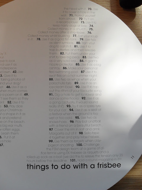
I have started reading and collecting FreeStyle Magazine. I absolutely love it and feel I can draw inspiration from here to our Zine we are creating.
In a sense, FreeStyle is so creative in its layout and form that it could almost be a Zine.
To start it comes in a different frisbee each issue designed by someone well known in the creative industry-the example I will show below is of one created by Paul Smith. The issue is also of a rounded shape so that it fits into the frisbee - something quirky I feel.
The particualar issue I am showing below features a contents in a weird numbered form to produce larger numbers and the editors letter and contributions is beautifully illustrated!
So from this magazine there is loads of inspiration. From the actual shape, the added extra of the frisbee, the images, the way the contents is layed out in a visual way and the fact it is designed by creatives for the creative industry.
Abbie xxx


No comments:
Post a Comment